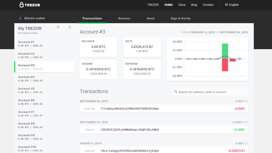
Satoshi Labs today released an updated version of its TREZOR Wallet, creators of the first bitcoin hardware wallet. The update includes a sleeker dark-colored design with a few improvements.
The company says the rebranding process is an ongoing task but for now, the company homepage at trezor.io, blog, and even the landing page for the Password Manager, have all received a refreshed look.
Improvements see the Transactions tab gain a new section with summaries. For those who use their coins on a daily basis, this serves as a convenient, quick overview of your account. The functionality of this section will be further improved in subsequent releases, adding advanced filtering features.
Small things, like the link to Device Settings, were also improved. Access buttons are marked clearer, as are currently active accounts or tabs.
The new version of TREZOR Wallet also incorporates several new features, which were before only usable in the command line interface, with trezorctl. For instance, users can finally use the Advanced Recovery, to restore your seed into your TREZOR.
Also, added was a Troubleshooter link into the Wallet. Whenever an error message shows up, users will be guided directly to the Troubleshooter, in order to solve the issue.
In case the Troubleshooter would not be able to find a satisfactory answer, users are then redirected to an email form, which will send an email with the details to the TREZOR support team.
The TREZOR team concluded with a word on privacy saying:
“While the TREZOR Wallet characterizes itself as ‘Your Private Bank’ – unlike a bank, it does not and will not ever track your usage. The Wallet does not keep any records of your activity, balances, addresses, flows, etc. and therefore there is no information which we could give to any third party. We recognize the necessity for privacy, as much as your right for privacy. In a sense, that makes TREZOR Wallet even better than a bank.”
